Photography
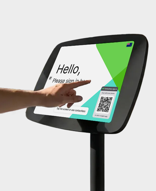
Photography should reflect the brand duality: security and warmth coexisting. Show real workplace environments where technology enables human connection. Images should be bright, well-lit, professional, and people-centric.
Device mockups

UI + devices


User interface
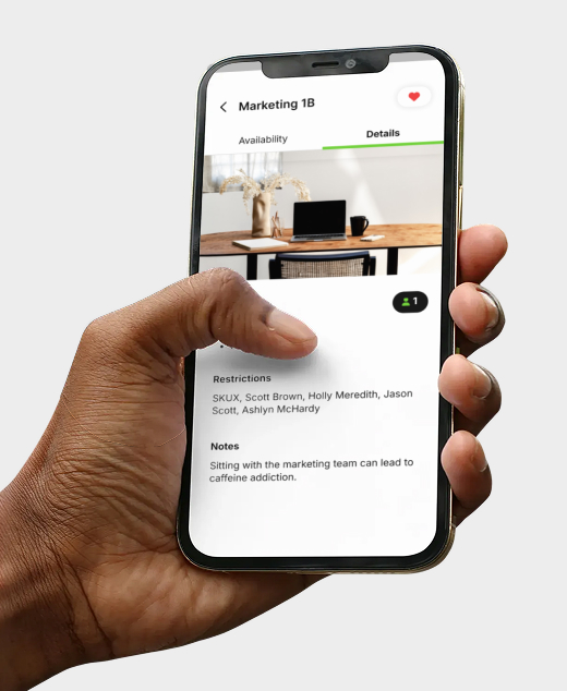
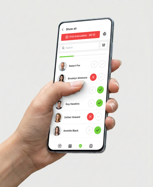
Our visual elements are built around clean, minimal design — rounded corners, soft shadows, and plenty of white space.
UI elements design
Elevated surfaces
UI cards use soft shadows and rounded corners (12px radius) to create an elevated, approachable feel. They sit on white/light gray backgrounds. They are displayed against white or light gray backgrounds, with the choice of background determined by the UI to ensure good contrast. A thin 1px solid stroke (#FAFAFA) can be used to improve contrast depending on what is behind the card.
Jane Doe
Visiting: Marketing Team
Check-in
10:30 AM
Status
Active